Symbols, Icons (Emojis) & Hex Codes in Excel + Power BI + Power Query
If you’ve ever wanted cleaner dashboards, faster “at-a-glance” reading, and less “wall of numbers” fatigue—Unicode symbols + hex colors are a surprisingly powerful combo. In this post you’ll learn practical, copy-paste-ready tricks for Excel, Power BI (DAX + conditional formatting), and Power Query. Check out some of our FREE templates and materials. PRACTICE MATERIAL BELOW!👇 Why this matters (real-life use cases) Status columns that actually read well: ✅ OK, ⚠ Warning, ❌ Issue, ⏳ Pending...

If you’ve ever wanted cleaner dashboards, faster “at-a-glance” reading, and less “wall of numbers” fatigue—Unicode symbols + hex colors are a surprisingly powerful combo. In this post you’ll learn practical, copy-paste-ready tricks for Excel, Power BI (DAX + conditional formatting), and Power Query.
Check out some of our FREE templates and materials.
PRACTICE MATERIAL BELOW!👇
Why this matters (real-life use cases)
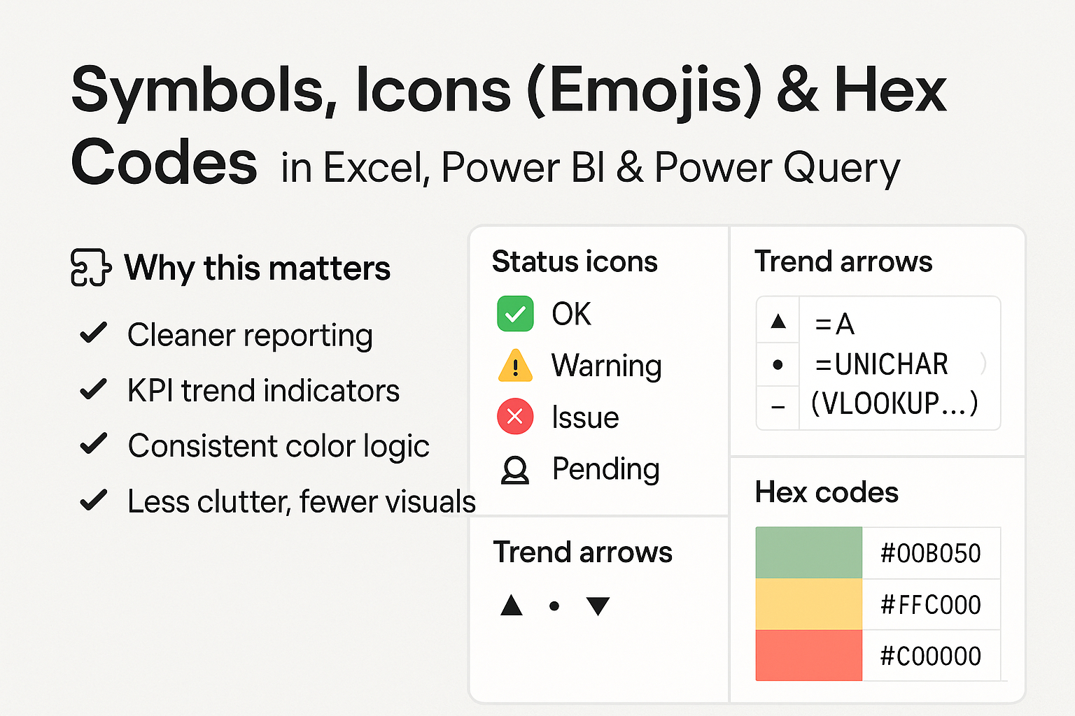
Status columns that actually read well: ✅ OK, ⚠ Warning, ❌ Issue, ⏳ Pending
KPI trend indicators: ▲ / ▼ / • without extra images
Consistent color logic across tools: use one mapping table (Status → Icon → HexColor)
Cleaner reporting: less clutter, fewer visuals, faster scanning
Excel: Add icons that behave like data (not pictures)
1) Status icons with UNICHAR() (no add-ins, no images)
In the provided file, Status is mapped to an icon code, and Excel generates the icon dynamically.
=UNICHAR(XLOOKUP([@Status],tblStatusMap[Status],tblStatusMap[IconCode]))Want a quick inline version without a mapping table?
=IFS(A2="OK",UNICHAR(9989),A2="Warning",UNICHAR(9888),A2="Issue",UNICHAR(10060),A2="Pending",UNICHAR(9203))Why it’s nice: filters, pivots, and formulas still work—because it’s just text.
💡 Pro Tip: Combine icon + label for “KPI-ready” text:
=UNICHAR(9989)&" "&A22) Trend arrows without conditional formatting
Use a single formula for ▲ / ▼ / • based on a % change:
=IF(B2>0,UNICHAR(9650),IF(B2<0,UNICHAR(9660),UNICHAR(8226)))This is perfect for compact tables where you don’t want extra bar charts.
3) Hex codes in Excel: great for standardizing colors (with one catch)
Excel can store hex codes like #00B050, but it doesn’t apply them as cell color by formula alone (Excel’s cell fill color is not a formula result).
What you can do reliably:
keep hex codes as a “design truth”
split hex to RGB numbers (useful for documentation, consistency, and VBA/macros)
Example splitting #RRGGBB into R/G/B:
=HEX2DEC(MID([@HexColor],2,2))
=HEX2DEC(MID([@HexColor],4,2))
=HEX2DEC(MID([@HexColor],6,2))
💡 Hidden trick (Excel formatting): you can still use Conditional Formatting rules based on Status (OK/Warning/Issue) and let hex live in a mapping table as your “source of truth”.
Power BI: Hex colors become dynamic formatting superpowers
1) The “Field value” conditional formatting pattern (the big win)
Power BI can read a hex color code from a column/measure and apply it as formatting.
Create a measure like:
Status Color =
SWITCH(
    SELECTEDVALUE('DemoData'[Status]),
    "OK",      "#00B050",
    "Warning", "#FFC000",
    "Issue",   "#C00000",
    "Pending", "#7F7F7F",
    "#7F7F7F"
)
Then in a table/matrix:
Conditional formatting → Font color (or Background)
Format by → Field value
Based on field → Status Color
💡 Pro Tip: This scales insanely well. You can swap themes or palettes by replacing just the mapping logic (or better: a mapping table).
2) KPI icons in DAX with UNICHAR()
Create a measure for status icons:
Status Icon =
SWITCH(
    SELECTEDVALUE('DemoData'[Status]),
    "OK",      UNICHAR(9989),
    "Warning", UNICHAR(9888),
    "Issue",   UNICHAR(10060),
    "Pending", UNICHAR(9203),
    BLANK()
)
Then create a “pretty KPI label”:
KPI Label =
[Status Icon] & " " & SELECTEDVALUE('DemoData'[Status])
✅ Works great in tables, matrices, cards (depending on visual), tooltips, and titles.
Power Query: Build one mapping table to rule them all
Power Query can generate characters from Unicode numbers and merge mappings into your data model.
Step-by-step pattern (recommended)
Create a small StatusMap table (Status, IconCode, HexColor)
Merge it into your fact table (DemoData)
Add an icon text column using Character.FromNumber([IconCode])
Example M snippet:
let
    Source = Excel.CurrentWorkbook(){[Name="tblDemo"]}[Content],
    StatusMap = Excel.CurrentWorkbook(){[Name="tblStatusMap"]}[Content],

    Merged = Table.NestedJoin(Source, {"Status"}, StatusMap, {"Status"}, "Map", JoinKind.LeftOuter),
    Expanded = Table.ExpandTableColumn(Merged, "Map", {"IconCode", "HexColor"}, {"IconCode", "HexColor"}),

    Icon = Table.AddColumn(Expanded, "Icon", each Character.FromNumber([IconCode]), type text),
    Label = Table.AddColumn(Icon, "StatusLabel", each [Icon] & " " & [Status], type text)
in
    Label
💡 Hidden trick: do all logic in the mapping table. Your fact table stays clean, and reporting stays consistent.
Practical “hidden” ideas you can steal today
Use one StatusMap across Excel + Power BI + PQ (copy/paste or store in SharePoint/CSV)
Use icons in titles and tooltips to reduce visual clutter
Keep hex codes in data so themes can change without touching visuals
Use ▲/▼ symbols in tables to avoid additional charts in tight layouts
Practice material
Use the included file:
DemoData sheet: sample dataset + icon/trend formulas + hex split
StatusMap sheet: status → icon code → hex color
ReadMe sheet: quick instructions
Do you need a starter Power Query Toolkit with some how-to guide, best functions and how to appy them in Excel and Power BI reports? Just with a slight adjustment to the quick and efficient flows. Check it out.
If you found this guide useful, explore the related posts below or download a free Power Query cheat sheet by subscribing to the Excelized newsletter.

👉 Want to learn this hands-on? Book a live 1:1 Excel Basic Course and go from raw data to confident reporting.