One Macro, One Full Excel Expenses Dashboard (with Claude AI)
Most expense reports start as a flat table — and stay that way. With a single VBA macro, you can turn that raw Data sheet into a polished, interactive dashboard, with no manual chart-building required. The macro does the heavy lifting. It formats your table, builds seven PivotTables, lays out six KPI cards (total spend, budget, approval rate and more), draws five charts, and wires up Month and Department slicers so everything filters together. A live status bar shows each step as it runs. All...
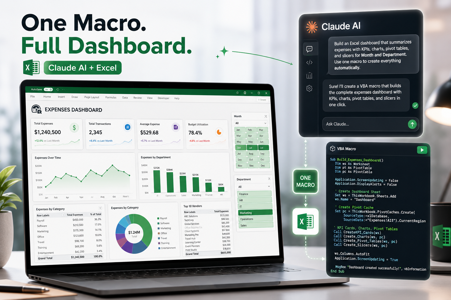
Most expense reports start as a flat table — and stay that way. With a single VBA macro, you can turn that raw Data sheet into a polished, interactive dashboard, with no manual chart-building required.
The macro does the heavy lifting. It formats your table, builds seven PivotTables, lays out six KPI cards (total spend, budget, approval rate and more), draws five charts, and wires up Month and Department slicers so everything filters together. A live status bar shows each step as it runs.
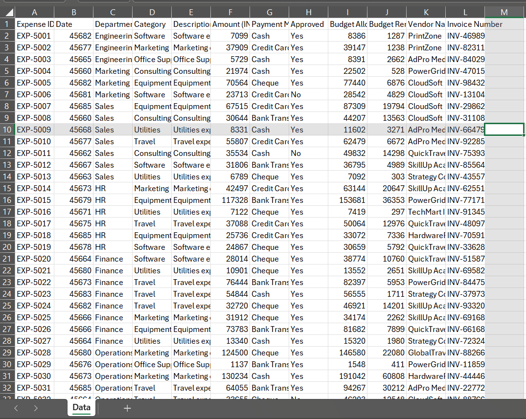
All you need is a sheet named Data with the right headers. Additionally, Claude or another AI tool. Run the BuildExpensesDashboard macro button that you will need, and the whole report builds itself — then refreshes the moment your numbers change. Turning Raw Data from the screenshot below:
To something like this:
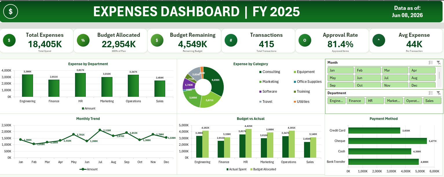
By using Claude (or other) AI tool:
With one click and a prompt:
Spare half a day by using and tweaking the prompts. Is this impressive or simply scary?
Credits: https://www.youtube.com/watch?v=NsZg0sgUFzU The whole file you can download here:
👉 Want to learn this hands-on? Book a live 1:1 Excel Basic Course and go from raw data to confident reporting.